Loading...
Loading...

CSS container queries are an alternative to css media queries, while media queries allows you to update css styles based on the device viewport dimensions, container queries allows you to update styles based on the continer / parent element's dimensions.
The container css short hand poperty, can used to specify the values of the container-name and container-type.
When applied to an element, establishes that element as the containers context. Anything placed in the container will receive the css treatments / styles from the contianer quary.
.cardGrid {
  // this is the shorthand container-name and container-type
  // container-name = gridContainer
  // container-type = inline-size
  container: gridContainer / inline-size;

  // the above code can be written with out the container shorthand
  container-name: gridContainer;
  container-type: inline-size;
}

.cardGridWrapper {
  padding: 0.5rem;
}

//  gridContainer will represent the container-name
@container gridContainer (min-width: 768px) {
  .cardGridWrapper {
    padding: 0 1.25rem 60px;
  }
}
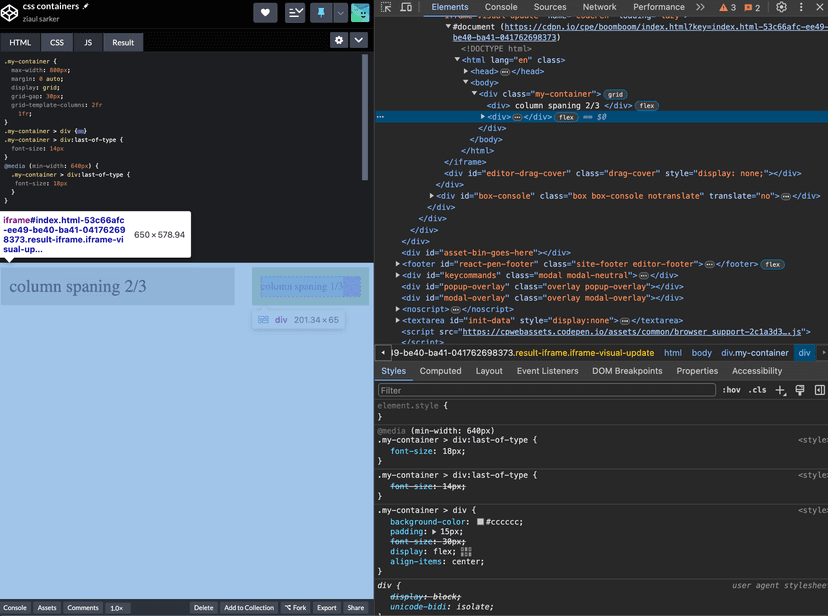
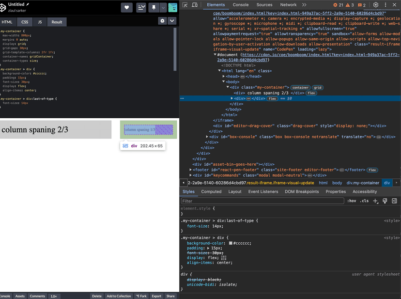
Why you might want to use containers over media queries? lets say you have a two column layout, one column spanning 2/3 and the other column 1/3 (2fr 1fr) and lets say we have media queries on the smaller column that applies a smaller font size when the min-width is smaller than 640px. Now this may work as expected when we are actually testing on a mobile device, but lets say we are using our laptop and we bring the browsers width to 800px and since our layout is a 2 column and our elemets width becomes less than 640px but our styles dont apply. This is where container queries comes in, since containers does not reply on device dimensions but rather the elemet wrapping it, our styles are now applied.
Here is an example of it using media queries
